
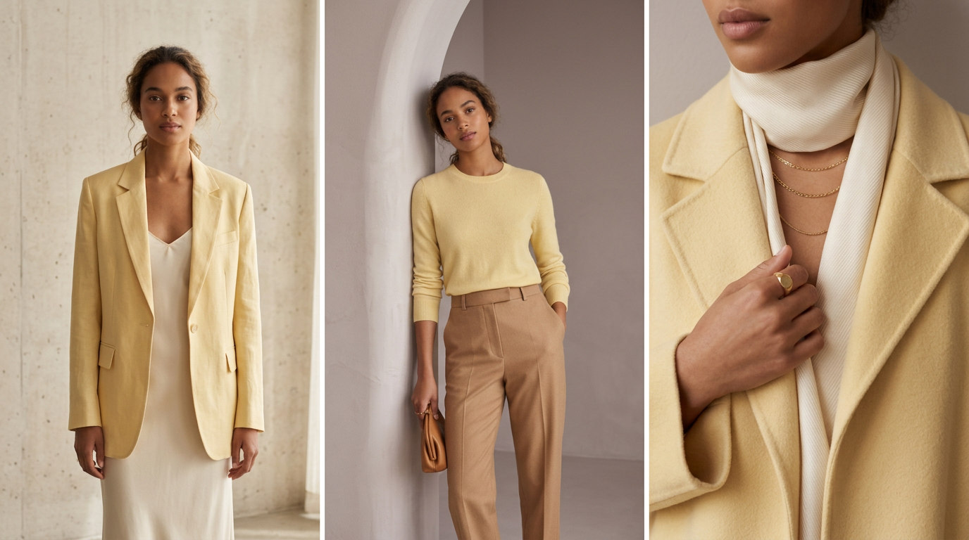
Yellow has spent years being the color everyone admired on other people. Too bright, too demanding, too likely to make you look faintly unwell under office lighting. Then butter yellow arrived — soft, warm, slightly dusty, closer to clotted cream than to a highlighter — and suddenly the whole objection collapsed.

We are always suspicious of a color that claims to suit everyone, so we went looking for the catch. There isn’t really one. Here are 8 ways to wear fashion’s softest color, in your wardrobe and in your house.
1. Know What You Are Actually Looking For


Butter yellow is not mustard, not lemon, and definitely not primary. It sits low in saturation with a warm, slightly milky base — think the inside of a croissant rather than the outside of a taxi. When you are shopping, hold the piece next to something pure white. If the yellow looks creamy and soft rather than acidic, you have found it.
2. Start With One Piece, Not a Whole Outfit


The fastest way to feel ridiculous in a new color is to commit to it head to toe on day one. Begin with a single generous piece — a knit, a shirt, a pair of trousers — and let everything else stay in colors you already trust. One butter yellow item in an otherwise familiar outfit reads as considered. Four of them read as a fancy dress theme.
3. Pair It With Warm Neutrals, Not Cold Ones


This is the detail that decides whether butter yellow looks expensive or looks like a hospital corridor. Cream, camel, tan, chocolate and warm greys make it glow. Stark optic white and cold charcoal drain it, because the blue undertone in those neutrals fights the warm base of the yellow. When in doubt, reach for cream instead of white.
4. For Contrast, Go Somewhere Unexpected


If neutrals feel too safe, butter yellow has three excellent partners that most people never try: chocolate brown, faded denim and a soft sage green. All three are muted enough not to overpower it, and all three sit far enough away on the color wheel to create genuine contrast. The combination people expect — yellow with black — is actually the least interesting of the lot.
5. Mind What Happens Near Your Face


Here is the honest part: butter yellow sits closest to fair, warm-toned skin, and can look washed out on cooler complexions if worn right up at the collar. The fix is not to avoid the color, it is to move it. Wear it below the waist, or keep a warmer layer at the neckline, and you get the whole trend without the grey-faced photographs.
6. Let Texture Change the Temperature


The same shade behaves completely differently depending on what it is made of. In a chunky knit or brushed wool it turns cozy and almost edible. In silk or satin it turns sharp and evening-appropriate. In cotton poplin it reads crisp and springlike. If you tried butter yellow once and disliked it, there is a decent chance you simply met it in the wrong fabric.
7. It Works Even Better on Your Walls


Butter yellow is one of the rare colors that flatters a room the way it flatters a face. In a north-facing space it counteracts grey light without turning the room into a novelty; in a small hallway it reads as sunlight rather than as paint. Pair it with unlacquered brass, pale wood and cream linen, and skip the pure white ceiling — a warm off-white keeps the whole thing soft.
8. If You Are Nervous, Buy It Small


Not everyone wants a yellow coat, and nobody has to have one. A butter yellow bag, a pair of ballet flats, a scarf, a candle, a stack of ceramic bowls — small doses give you the entire mood at a fraction of the commitment and a fraction of the price. This is also the smartest way to test whether you genuinely like a trend or merely like it on other people.
Butter yellow is having its moment precisely because it asks so little of you — it is a bright color that behaves like a neutral. Are you wearing it, painting with it, or watching from a safe distance? Let us know in the comments!



Leave a Reply