
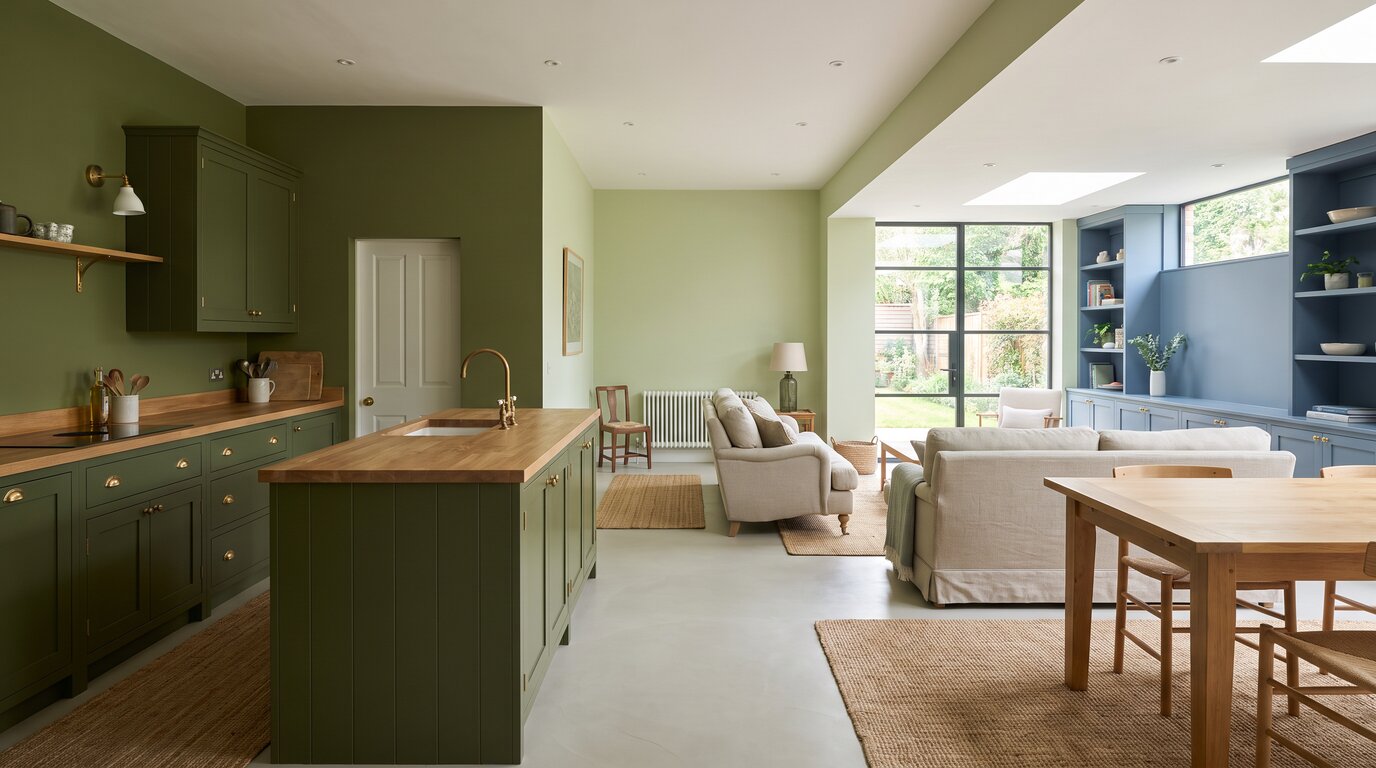
Three of the big paint brands have now picked their 2027 colour of the year, and the striking thing is how much they agree. Behr went with Grounded, an earthy olive. Sherwin-Williams chose Celery, a soft green with a yellow undertone. Valspar got there first with Cottage Door, a mid-tone blue that reads almost as a neutral.
At Circus of Wonders, a colour of the year is only interesting once you know where it actually goes on a wall. Here are 8 ways to use all three, including the rooms they rescue and the one test worth doing before you commit.
1. Put the Olive on the Lower Cabinets


Behr’s Grounded is an olive with enough brown in it to behave like a neutral, which makes it the safest of the three on kitchen cabinetry. Keep it to the base units, leave everything above pale, and the green reads as depth rather than as a colour decision. Unlacquered brass handles are the obvious pairing and still the right one.
2. Use the Celery in a Room That Never Gets Sun


Celery has a yellow undertone, which is precisely what a north-facing room is missing. Cool grey light turns most greens grey and sad; this one holds onto its warmth and makes the room feel like the sun is somewhere nearby. It is the single most useful thing about the shade and the reason to choose it over a sage.
3. Save the Blue for the Front Door


Cottage Door is a mid-tone blue carrying both warm and cool undertones, which is exactly the quality a front door needs: it has to work against brick, stone or render without arguing with any of them. One coat on the door, nothing else changed, and the whole front of the house looks considered.
4. Olive on the Woodwork, White on the Walls


The inverse of a colour-drenched room and far easier to live with. Skirting, architraves and door frames in Grounded, walls left chalky white, and the architecture of the room suddenly has an outline. It is also the cheapest way to try an olive, because woodwork takes a fraction of the paint that four walls do.
5. Put the Celery on the Ceiling


Brilliant white ceilings are a habit rather than a decision, and a soft green one is a genuine surprise the first time you look up. Celery is pale enough that the room does not shrink, and the reflected light it throws down is noticeably kinder than white. Walls in a warm off-white, ceiling in the green, nothing else.
6. Drench a Bedroom in the Blue


Cottage Door is the one of the three that survives being used everywhere in a room. Walls, ceiling and woodwork all in the same blue removes every edge and corner, and because the shade sits so close to neutral it reads as calm rather than as a themed room. This is the only one of the eight that needs commitment.
7. Use All Three in One Open Space


They were chosen independently and they still sit together, which tells you something about where paint is heading. Olive on the kitchen end, celery through the middle, blue in the far corner or on a single joinery run. The trick is giving each one a whole zone rather than a wall, so the eye reads them as different rooms.
8. Test It on Two Walls, Not One


All three of these shift considerably depending on the light hitting them, and a sample painted on one wall tells you almost nothing. Paint a large patch on two walls facing different directions, then look at both in the morning, at four in the afternoon and under a lamp. Most regrets happen because someone skipped the third look.
Three brands, three shades, and one clear direction: colours that behave like neutrals but refuse to be beige. Whether you commit to a whole bedroom or just a door, all three reward being tested properly first. Which one would go on your walls? Let us know in the comments!



Leave a Reply