
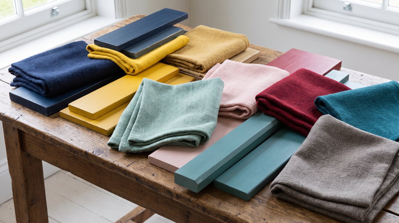
Choosing colours is the part everyone gets stuck on, which is odd, because the problem was solved centuries ago by people who had far fewer options than we do. A painter working in 1665 had perhaps a dozen pigments, some of them ruinously expensive, and had to make them sing together anyway. The combinations that came out of those constraints are still the best ones available, and nobody has to pay for them.
At Circus of Wonders we are shameless about borrowing from people who knew what they were doing, so we went looking for palettes rather than pictures. Here are 12 colour schemes lifted straight from famous paintings, what makes each one work, and the most straightforward way to put it into a room or an outfit.
1. The Starry Night — Van Gogh


Painted in 1889 and now at MoMA, it runs on one idea: a vast field of midnight and cobalt blue interrupted by small amounts of chrome yellow. The yellow covers perhaps a twentieth of the canvas and carries the whole thing. Paint a room deep blue, keep every light source warm and yellow, and add nothing else. The ratio is the trick, not the colours.
2. Girl with a Pearl Earring — Vermeer


Vermeer’s painting of about 1665, in the Mauritshuis, puts a saturated ultramarine turban and a band of warm ochre against a background that is effectively black. Two strong colours, one void. As an outfit it is almost foolproof: navy and mustard worn over charcoal, nothing patterned, nothing competing. The dark ground is what makes both colours look expensive.
3. The Great Wave off Kanagawa — Hokusai


Made around 1831, and the blue is the story: Prussian blue, a synthetic pigment that only reached Japan in the 1820s and which Japanese printers called bero-ai. Hokusai used it in layers, dark to pale, against uncoloured paper. A room built the same way, one blue at three strengths over cream, needs no second colour at all. Monochrome schemes fail when the range is too narrow.
4. Nighthawks — Hopper


Hopper’s 1942 painting at the Art Institute of Chicago is built on an acid yellow-green interior glowing inside a deep teal night, with one figure in cherry red. That red is tiny and it is the first thing you see. In a kitchen: deep teal units, warm green-gold light, and exactly one red object. The moment there are two, the effect dies.
5. The Kiss — Klimt


Klimt covered the 1907–08 canvas now in Vienna’s Belvedere in real gold leaf, then kept almost everything else ivory and warm grey, with a scatter of coloured flecks the size of coins. The lesson is restraint: gold works when it is the only metal and the only pattern. Brass fittings, cream walls, and small pieces of colour that do not repeat.
6. Water Lilies — Monet


Monet painted roughly 250 of these, so there is no single canvas to copy, but the palette barely changes: sage and olive greens, lavender, dusty pink, and a blue that is nearly grey. Nothing is fully saturated and nothing has an edge. It is the most forgiving scheme on this list, and the one that most reliably makes a bedroom feel quiet.
7. The Dessert: Harmony in Red — Matisse


Painted in 1908 for the Moscow dining room of the collector Sergei Shchukin and now in the Hermitage, it is a flat field of deep red covering wall and tablecloth alike, cut with cobalt blue arabesques and a green window. Letting one colour run across two surfaces is the whole move. Match a tablecloth to the wall behind it and the room reads as deliberate.
8. Composition II in Red, Blue and Yellow — Mondrian


The 1930 version lives at the Kunsthaus Zürich and is mostly white. People remember it as primary colours, but the red block is large, the blue and yellow are small, and black lines do the structural work. Translated to a room: white walls, black-framed windows or furniture legs, and three accents in unequal amounts. Never equal thirds.
9. The Birth of Venus — Botticelli


Botticelli’s panel of about 1485, in the Uffizi, pairs pale seafoam green with shell pink and a quantity of gold, all of it low in saturation and sitting on cream. It is the original soft palette and it still reads as expensive rather than sweet, mostly because the green stops the pink becoming sentimental. Works far better on fabric than on walls.
10. Christina’s World — Wyeth


Wyeth’s 1948 tempera at MoMA is almost entirely dried-grass ochre, with a faded rose dress and a grey-brown house on the horizon. It is a neutral scheme with one warm tone doing all the work, and it is the answer for anyone who wants a beige room that is not boring. The trick is a single muted pink somewhere in it.
11. Ophelia — Millais


Millais painted the landscape outdoors by the Hogsmill River in Surrey across 1851 and 1852, and it shows: the palette is a dozen greens, from near-black water to silvery willow, with one silver-white dress and a few specks of flower colour. Layering greens of different temperatures, rather than matching them, is why plant-heavy rooms either work or look like a garden centre.
12. Arrangement in Grey and Black No. 1 — Whistler


Better known as Whistler’s Mother, painted in 1871 and owned by France since 1891, it hangs in the Musée d’Orsay. Whistler titled it as an arrangement of colours on purpose: warm greys, black, and a few inches of cream. A room done this way lives or dies on texture, because nothing else is happening. Get the greys slightly different from each other and it reads as considered.
The useful thing about stealing from painters is that they were working with ratios, not colour cards. Almost every palette here is one dominant field, one supporting tone and a very small amount of something that does not belong, and the small amount is always smaller than you would dare. Which of these would you actually live inside? Let us know in the comments!

Leave a Reply